Managed Futures Dashboard:
Top Managed Futures News, Listings, Member Posts, Managed Futures Daily Indices and more!
In the last post in our machine learning series, we showed how nonlinear regression algos might improve regression forecasting relative to plain vanilla linear regression (i.e., when underlying reality is nonlinear with complex interactions).
In this piece, we’ll first review machine learning for classification, a problem which may be less familiar to investors, but fundamental to machine learning professionals. Next, we’ll apply classification to the classic value/momentum factors (spoiler: the results are pretty good).
Part 1: An Introduction to Classification Algorithms
Part 2: Applications in factor investing
Part 1: An Introduction to Classification Algorithms
What Is Classification?
Regression predicts a continuous value: for example, the return on an asset.
Classification predicts a discrete value: for example, will a stock outperform next period? This is a binary classification problem, predicting a yes/no response. Another example: Which quartile will a stock’s performance fall into next month? This is multinomial classification, predicting a categorical variable with 4 possible outcomes.
In this post:
- We’ll break down a classification example “Barney-style” with Python code.
- We’ll present a high-level overview of classification algorithms.
- Finally, in part 2, we’ll apply classification to a portfolio to generate an investment strategy by classifying expected returns by quintile.
From classification, it’s a short step to deep learning problems like handwriting recognition, or image labeling. Classification is a fundamental building block that enables machine learning to perform incredible feats.
Classification essentials
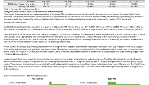
We start (code is here) by generating random data with two predictors (the x-axis and y-axis) and a variable with two labels (red or blue). The numbers are generated from a truncated normal with [0,100] bounds (see here for details).
-2000 red dots are centered around x = 25, y = 25 with a standard deviation of 50, and assigned label = 0.
2000 blue dots are centered around x = 80, y = 80 with a standard deviation of 20, and assigned label = 1.
We would like to find a function that takes the coordinates x and y, and returns an accurate prediction of 0 (blue) or 1 (red).
Logistic regression is a simple, popular classification algorithm.
Here are the basics of how it works:
- Apply a linear decision function of x and y that outputs a numeric variable: -
- Apply a sigmoid ‘squashing’ function to Z that maps large positive numbers to a probability estimate close to 1, and large negative numbers to a probability close to 0.
- Apply a loss function that measures prediction error. The loss should be close to 0 when the prediction is close to 1 for the blue observations (label=1); and also close to 0 when the prediction is close to 0 for the red observations (label=0).
- Finally, find the parameters a, b, c of our linear function that minimize the loss function.
If we can train our classifier so its average loss is near zero, we will obtain good matches between our predictions and observed values.
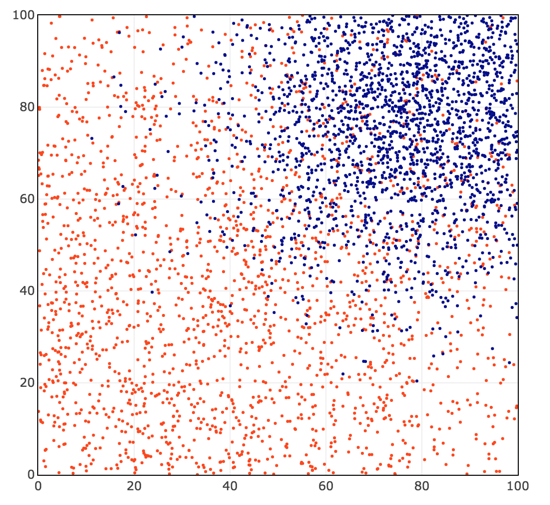
We find a, b, and c that minimize the loss via gradient descent: choose random starting values for a, b, c, determine in which direction they need to be updated to reduce the total loss over all training observations, and iteratively update a, b, and c until we find values that achieve a minimum loss.
We obtain a classification (blue/red shading) that looks like this:
-Now, let’s look a little more closely at the math behind these four steps. (If you’re not into the math, you can skip down, but it’s not very difficult, and after all Alpha Architect is a quant finance blog!)
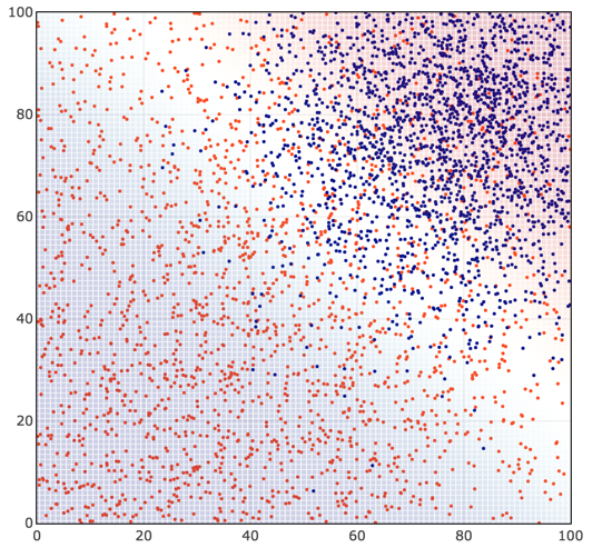
Decision function: - is proportional to the Euclidian distance from (x, y) to the line defined by - . It represents how far a point is from the decision boundary, the classification margin.
(1)
-
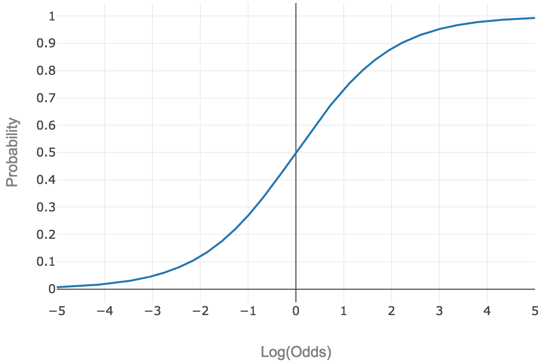
‘Squashing’ function: For logistic regression, the squashing function is the logistic function: -
This type of function, which maps [-∞, +∞] to [0, 1], is called a sigmoid function. It looks like a sideways S, and we’ll denote it as - .
An intuitive explanation of the logistic function is that it converts log odds to a probability between 0 and 1.
-Suppose you take Vegas-style odds like 3:1, which maps to a probability of 0.25 (1/(3+1)). How do we get there with our sigmoid function? (2)
- -
- -
- -
In other words, logistic regression models log odds as a linear function of the distance from the decision boundary.(3)
Loss function: Suppose the predicted probability of blue (label = 1) is 0.8. What is our measure of the validity of this prediction? For binary classification, we will seek to minimize log loss (also known as binary cross-entropy).
-
where y is our label (0 for red, 1 for blue) and p is our predicted probability of label = 1 (blue).
A good way to visualize log loss is as -log(correctness). If our prediction is 100% correct, log loss is 0. If our prediction is 0% correct, log loss is +∞.
To break it down further: Our observed label y is either 0 or 1. Our probability prediction p is between 0 and 1, exclusive.(4)
If the observed label y is 1 (i.e., blue), and our predicted probability is p (i.e., .8), then - . The second term goes away since 1-y=0. For a prediction close to 1, the log loss is close to 0. For a prediction close to 0, the log loss is very large.
Conversely: If the observed label y is 0 (i.e., red), then - . The first term goes away since y=0. For a prediction close to 0, the log loss is 0. For a prediction close to 1, the log loss is very large.
-In these four steps, we reduced our binary classification problem to the following:
- Find a, b, c…
- that minimize the average log loss of the sigmoid function - …
- over all training observations.
That’s the setup. The essence of binary classification: find a function of the predictors (a, b, and c) that outputs a probability of the class label being 1, while minimizing the log loss function. We can leverage computers to make this happen.(5)
A Final Point
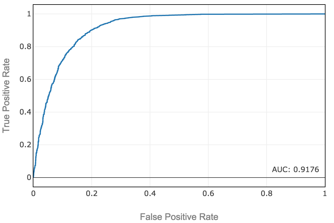
We predict the blue class when the predicted probability exceeds a probability threshold. In general, we should not assume that our decision boundary must be at the 50% probability line. In a real-world problem, we should consider the cost of false positives vs. false negatives. As we raise the probability threshold, we reduce the number of false positives and increase the number of false negatives. The ROC curve can help us visualize that. We want to choose a decision boundary threshold that maximizes real-world performance, where if we increase the threshold for a positive prediction, the marginal gain of fewer false positives equals the cost of additional false negatives.
-The example above is a fake problem with no real-world costs of false positives and negatives, so let’s just maximize accuracy. After selecting a threshold to maximize accuracy, we obtain out-of-sample test accuracy of 84.4%, and an area under the ROC curve of 91.6%.(6)
We now have a solid template to perform classification, using this framework of logistic regression, the ROC curve, and choosing a threshold to maximize the F1 score. See our python notebook, specifically cell 18.
An Overview of Classification Algorithms
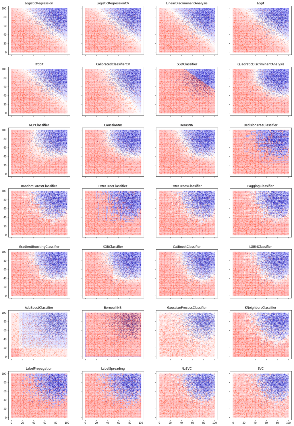
In our classification code template, we can easily swap out logistic regression for any other sklearn classification algorithm. We can even enumerate all the available classification functions, and run them all on our data via our template:
-That is a lot of classifiers!
Let’s go over the key concepts and characteristics of classifiers. The key discussion points relate to how these algorithms classify a discrete response y, given the predictors X.(7)
Key Questions a Classifier Must Address
- What underlying distribution of y given X are we modeling? (Logistic regression: linear relationship between predictors and log-odds.)
- What is the shape of the decision boundary? Linear, piecewise linear, nonlinear, what broad functional specification? (Logistic regression: linear decision boundary)
- What is the loss function we are minimizing over the underlying distribution and functional specification? Popular loss functions are mean-squared-error (for regression), cross-entropy loss, hinge loss, Huber loss. (Logistic regression: Log loss or cross-entropy)
- What is the mechanism for controlling overfitting and optimizing the bias/variance tradeoff? (Logistic regression: Regularization can be used to apply a penalty to large coefficients and shrink them, biasing the model toward low coefficients.(8)
- Finally, what does the algorithm look like? i.e., How do you train it? How does it predict y given X? What is the computational complexity of the algorithm? (e.g., Logistic regression is simple and fast, neural networks take a relatively long time to train and tune.) Is the classifier generative or discriminative? A generative classifier models the full joint distribution of X and y; a discriminative classifier creates a less complete model. (Logistic regression just models P(y|X) as opposed to the full joint distribution, so it is a discriminative classifier.(9)
Digging in on the Classification Methods
The first 5 classifiers in the classification ensemble picture above produce linear decision boundaries. Using our fake problem above, these classifiers produce essentially identical results. They have minor differences in assumptions about underlying distribution, loss functions, and controls for overfitting.
Other classifiers have smooth nonlinear decision boundaries: Quadratic Discriminant Analysis, Multi-Layer Perceptron, Gaussian Naive Bayes, and our Keras NN (which is similar to MLP).
Others are piecewise linear or smooth: KNN, Trees, Bagging, Boosting. For example, K Nearest Neighbors (KNN) works by finding the k nearest neighbors of any point (e.g., k=5). Assign the label of the majority of those 5 neighbors. Choose k based on best performance in cross-validation.
Boosting models are currently the state of the art for classification of tabular data(10). They win a lot of Kaggle machine learning contests. They use ensembles of decision trees.(11)
Here are some high-level descriptions of various techniques:
Decision trees: Find the rule of the form x or y > k, which labels the training observations and gives the lowest average loss. In other words, partition the graph into 2 parts and label one partition 0 and the other 1, using a simple one-variable rule that minimizes the loss function. Next, take each partition, and partition it in the way that minimizes the loss function. Continue until no further loss reduction can be achieved in cross-validation. This tends to yield a patchwork of small squares (and will overfit training data if you don’t cross-validate carefully).
Bagging: Instead of using the single best decision tree for your training data, 1) build many decision trees using a randomly selected half of your data, and 2) have them vote on the prediction for each observation. This is ‘bootstrap aggregation’, hence bagging. It acts like regularization. A single decision tree will produce the best possible partition of your training data. Bagging, by having many classifiers that each see part of the data, will produce a slightly worse result in your training data, but will generalize better out of sample. Many weak rules are better than a single perfect rule, because they are less likely to overfit the training data. We can control overfitting by adjusting the number of trees, the depth of the trees, the size of the random subsets, and choose the best combination of these hyperparameters using cross-validation.
Random forest: Build trees using both random subsets of data and random subsets of predictors. This prevents the classifier from becoming over-reliant on any particular set of predictors and generally works even better out of sample than bagging.
Boosting: Bagging and random forest are ensemble methods which generate many independent weak classifiers that are run in parallel and then aggregated by e.g. voting. Boosting is an ensemble method where you train many classifiers, but in sequence, at each step training a new classifier to improve prediction on the observations that were previously misclassified.
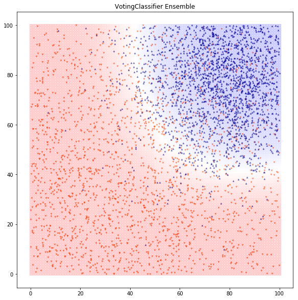
Ensembles: After running many classifiers and selecting good ones, we can feed their output to the final classification model. In this example, we ensemble the models using a voting classifier and we get about 85.9% accuracy and AUC of 92.4% (a slight improvement vs. the simple logistic regression):(12)
We now have a solid toolset for classifying a dataset. In the real world, 80% of the battle is building a mental map to attack the problem, collecting and scrubbing a good dataset, and engineering good features that let you classify well.
Conclusions Regarding Classification Algos
What have we learned?
- The fundamentals of classification.
- How to perform and interpret logistic regression — a simple classification algorithm.
- Key characteristics of different classification algos.
- Boosting is the state of the art for tabular data.
- How to create an ensemble that combines several classification algorithms for improved results.
Classification is a fundamental building block of machine learning. Most machine learning magic starts with classification: understanding spoken speech starts with classifying audio patterns as spoken phonemes and words; self-driving cars start with classifying images and objects as ‘stop sign’ or ‘deer in the road.’ When you chain many neural network layers and train them end-to-end with a categorical cross-entropy loss, you get complex emergent behavior and deep learning.
In Part 2, we’ll apply classification to build a portfolio using a value/momentum framework.
Part 2: Factor Investing Applications
In Part 1, we reviewed the fundamentals of classification. In part 2 we will cover the following:
- Applying classification to a value and momentum model;
- Evaluating classification’s performance in a mean-variance framework;
- Comparing classification to regression.
The Basics of Value and Momentum
Buy Cheap: Value
A value strategy buys stocks that look cheap: a fundamental valuation metric indicates they represent high underlying return potential per dollar invested. We use price/book value (P/B), which is simple and often used in academic research (e.g., Fama and French 1992,1993). We bucket our universe into P/B quintiles each month and simulate returns of each quintile the following month. All results are from 1973 to 2017 and reflect total returns, which include distributions.(13)
- The results are hypothetical results and are NOT an indicator of future results and do NOT represent returns that any investor actually attained. Indexes are unmanaged and do not reflect management or trading fees, and one cannot invest directly in an index.Based on our sample from 1963 to 2017 we confirm the standard result in academic research — value “works.”
Buy Strong: Momentum
We similarly backtest a relative strength momentum strategy: buying the stocks that have been going up the most recently (12-2 momentum).
There are plausible reasons stocks may gradually react to good news, which has the potential to create momentum effects.
- Gradual information diffusion: As prospects improve, initially only insiders realize it; then profits increase, but are viewed as possibly transitory; then markets price in durable improvement.
- Under-appreciated second-order effects: Companies that outperform have advantages in hiring, deal-making, media coverage, which enable them to continue outperforming, perpetuating a virtuous cycle as in Soros’s reflexivity thesis.
- Behavioral biases like recency bias; reporting biases like earnings management to show gradually increasing growth.
Nobody has really nailed down the exact reasons why momentum works and the same can be said for just about everything in the stock market. Nonetheless, momentum is a well-documented market anomaly.
To investigate the core academic anomaly, we divided our stocks into quintiles according to how much they went up in the trailing 12-month period.
Here’s how they did:
- The results are hypothetical results and are NOT an indicator of future results and do NOT represent returns that any investor actually attained. Indexes are unmanaged and do not reflect management or trading fees, and one cannot invest directly in an index.Cheap and Strong: Value and Momentum
To give ourselves a single baseline for value and momentum, we combine the value and momentum scores into a single score(14), rank the stocks by combined score, and create quintile portfolios, rebalanced monthly.
- The results are hypothetical results and are NOT an indicator of future results and do NOT represent returns that any investor actually attained. Indexes are unmanaged and do not reflect management or trading fees, and one cannot invest directly in an index.That’s a good baseline for a naive model, about a 0.47 Sharpe. Let’s see if we can do better with a machine learning classifier.
Do Simple Classifications Work?
Well, yes! We just did the most basic naive classification: Put each stock into a quintile bucket according to its trailing value / momentum rank. Invest in e.g. the top quintile, and rebalance monthly.
A slightly more sophisticated framework: Use logistic regression to predict which return quintile bucket each stock will fall into and invest in those with the highest predicted returns.
Essentially, we are saying that a 50/50 combination of the value and momentum scores is not necessarily ideal. We want to find a linear combination of the predictors that produces the best classification into quintile buckets.
The predictors are value (P/B), momentum (12-2), and, as another twist, a dummy variable for financials. The impact of P/B varies across industries, and financials may be the most extreme example.
The discrete response variable is the quintile each stock’s 3-month return will fall into over the next 3 months. I chose 3-month return to smooth out some of the noise in monthly returns.
We initially train on 120 months (10 years) and predict the quintile each stock will fall into on the 121st month. Then we walk forward month by month, using all available history to predict the next month.
Finally, since we predicted 3-month returns, we simulate investing 1/3 of the portfolio each month in each quintile and holding them for 3 months. We chart performance of each quintile portfolio:
- The results are hypothetical results and are NOT an indicator of future results and do NOT represent returns that any investor actually attained. Indexes are unmanaged and do not reflect management or trading fees, and one cannot invest directly in an index.That is … not great! The stocks predicted to be in top quintile perform essentially the same (0.50 Sharpe) as the baseline model that simply owns the portfolio of stocks with the highest rank on value/momentum (0.47 Sharpe).
What happened? Why didn’t our fancier methodology work better?
The vanilla classification loss function associated with logistic regression is log loss.(15) Log loss only cares about how well it predicts the correct quintile. Log loss has no concept that not all errors are created equal. For example, when an observation is actually in the bottom quintile, a prediction that it will be in the top quintile is a greater error than a prediction it is in the fourth quintile.
Another issue with classification: Consider a situation where classification outputs the following five probabilities for the five quintiles: 0.30, 0.09, 0.11, 0.21, 0.29.(16)
Do I really want to classify this observation in the first quintile (30%) when the probability of being in the last quintile is approximately the same (29%)? A pretty noisy signal!
Leaning on out-of-the-box classification algos can also lead to an unbalanced classification. The mean of classification probabilities by class is 0.2, but always picking the top probability could also lead to significantly more than 20% in, for instance, the bottom or top buckets.
Indeed, this is what we see when we plot a histogram of quintile predictions. We get a large excess of predictions in the bottom 2 buckets. Ack!
-Can We Fix Classification?
To rescue classification, given the classification probabilities above, I computed a weighted average bucket prediction:
0.30 x 0 + 0.09 x 1 + 0.11 x 2 + 0.21 x 3 + 0.29 x 4 = 2.1
This prediction of slightly above the mean is more reasonable than assigning bucket 0, given these probabilities. Then I can bucket stocks into quantiles using this prediction, and get consistent, balanced buckets.(17)
Here are the results of using a tweak on the classification buckets:
- The results are hypothetical results and are NOT an indicator of future results and do NOT represent returns that any investor actually attained. Indexes are unmanaged and do not reflect management or trading fees, and one cannot invest directly in an index.The good news: our results are much more consistent. Returns and Sharpes increase consistently from bottom to top quintile.
The bad news: our top quintile (Sharpe 0.46) is actually a little worse than our first logistic regression model.
Reality is messy. This may be because we now have 20% of stocks each month in the top quintile. Our first logistic regression assigned relatively few stocks to the top quintile as the most likely outcome, and so we got the best of the best (and probably more concentrated portfolios).
Does More Advanced Classification Work?
Maybe we’re on the right track. Can we improve on the baseline using a more advanced classifier?
Gradient boosting models are the current state of the art for classification and regression using tabular data. We use XGBoost to predict the same discrete response variable: which quintile will a stock’s next 3-month return fall into.(18)
We use the same methodology of predicting quintile probabilities, computing a weighted-average quintile prediction, generating predictions for 1973-2017 (we train on the 10 years prior) by walking forward one month at a time, and finally simulating a portfolio investing in each prediction quintile.
Note: These results are preliminary and should be taken with a huge grain of salt. We’ve got a lot more work to do and need to dig into the weeds (which we’ll do for future posts).
Here is performance by quintile:
- The results are hypothetical results and are NOT an indicator of future results and do NOT represent returns that any investor actually attained. Indexes are unmanaged and do not reflect management or trading fees, and one cannot invest directly in an index.Wow. The preliminary results were better than I expected (0.87 Sharpe), which got me thinking…
Is Classification the Right Answer?
The XGBoost classification result is promising (and almost too good to be true!), but the way we obtained it forced me to address reasons not to use classification for this problem:
- Loss of information when we collapse the return target variable into quintile buckets. This may not be all bad. Using 3 month returns instead of 1-month returns loses information, but much of the lost information may be noise. Bucketing similarly may reduce overfitting to noise, improving results, like regularization.
- Loss of information due to lack of order.(19) As discussed above, log loss only cares about predicting the correct quintile as often as possible, and has no concept of consistent ordering, or getting as close as possible to the correct quintile.
These are a few reasons I originally wanted to try classification:
- Portfolio construction can be expressed inherently as a classification problem: you classify stocks when you bucket them into portfolios.
- When we minimize regression mean squared error (MSE), improving MSE didn’t always get better portfolio buckets (partly because we had low R-squared), as we found in a previous post.
- I wanted to write about a classification example and understand/explain it in a portfolio selection context.
Bottom line: I don’t recommend vanilla classification for a portfolio selection model like this. Classification is an extremely useful approach to problems like predicting earnings beat/miss, default risk. But, as a rule of thumb, if you have to bucket a response variable, it might be worth thinking about alternatives to classification.(20)
Why Not Just Use Regression?
Finally, let’s compare XGBoost classification to XGBoost regression. In contrast to XGBoost classification, which predicted discrete quintile buckets, we predict the 3-month returns as a continuous variable, minimizing mean squared error. Then, we bucket the forecast returns into quintiles and simulate investing in each quintile.
- The results are hypothetical results and are NOT an indicator of future results and do NOT represent returns that any investor actually attained. Indexes are unmanaged and do not reflect management or trading fees, and one cannot invest directly in an index.That’s even better than the classifier, around 1.03 Sharpe, which is the stuff of legends. We’ll dig in a bit more into this concept in the future and these results should definitely be viewed with a skeptical eye, but at a first glance things look promising.
Conclusions on Classification
What have we learned?
- Simple value and momentum strategies work well.
- Vanilla classification has problems in a portfolio selection context, and doesn’t improve on a simple average of value and momentum scores.
- Gradient boosting classification improves significantly on simple strategies.
- Regression may be a better starting point for this problem, and gradient boosting regression improves significantly on gradient boosting classification.
Possible shortcomings:
- Theoretical models should be easily understandable, and inherently over-simplify. Highly optimized empirical models are hard to interpret, and we need to be very careful about overfitting limited data.
- Machine learning models in general, and especially gradient boosting models, are on the black-boxy end of the spectrum.
- We should apply a reasonable amount of optimization for the real-world problem we are trying to solve. The nature of the beast is that gradient boosting probably selected rules that were maybe a little lucky to work really well in the past, and other people have probably found similar patterns and are trying to exploit them going forward. So we shouldn’t expect this to work as well in the future.
Possible enhancements, directions for more work:
- Test additional factors: EPS, FCF, PEG, or multi-metric value models instead of P/B; quality, size.
- Industry (or large scale sectors like financial/nonfinancial/tech where value may be measured differently). A good historical industry taxonomy for this purpose is important and the 48 Fama/French industries aren’t ideal.
- Smoothing methods like a denoising auto-encoder; other ways to optimize turnover.
- Ordinal regression methods.
- Portfolio optimization using regression forecasts as input.
- Gain a better understanding of the nonlinear relationships XGBoost is finding, and using that information intelligently to come up with simple rules which may be faster and more robust, for instance using nonlinear thresholds, polynomial features (squaring and cubing the predictors).
I hope this post shows preliminary evidence that machine learning algorithms might be able to improve investment results vs. more vanilla methods. This post also provides a roadmap for applying these ideas in practice.
- The views and opinions expressed herein are those of the author and do not necessarily reflect the views of Alpha Architect, its affiliates or its employees. Our full disclosures are available here. Definitions of common statistics used in our analysis are available here (towards the bottom).
- Join thousands of other readers and subscribe to our blog.
- This site provides NO information on our value ETFs or our momentum ETFs. Please refer to this site.
References [ + ]
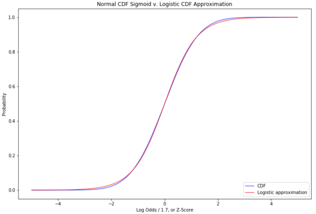
1. ↑ The distance from the line defined by - to a point - is - . Since - is constant with respect to x and y, - has a linear relationship to the classification margin.The red/blue shadings define a plane if you visualize color intensity in the z-axis. The blue areas are positive, the red areas are negative, with z = 0 at the decision boundary. (Although our colorings are based on logistic_function(Z), not Z itself)2. ↑ To match Vegas odds, we have to take the inverse of the way they are normally quoted, or take - but you get the idea.3. ↑ This is not the only possible ‘squashing’ function. We can use any function that maps the interval [-∞, +∞] to the interval [0,1]. We could use sigmoid(straight odds) instead of sigmoid(log-odds). We could use the normal cumulative distribution function (CDF) which maps the z-score to the area under the normal distribution up to that z-score — our familiar statistical significance tables. If you take the derivative of the normal CDF function, you get the probability density of the normal distribution. If you take the derivative of the logistic function, you get the probability density of the logistic distribution: the logistic function is the CDF of the logistic distribution. If we use the normal CDF as our sigmoid function, we are doing a probit model. If we use our logistic sigmoid, we are doing a logit model. The choice of sigmoid reflects the distribution you are modeling. In machine learning, we generally use the logit model. If you have a good reason to believe you are modeling a normal distribution, and the distance from the decision boundary has a linear relationship to the z-score, then the probit model is technically correct (the best kind of correct). If you don’t know your distribution is normal but have good reason to think log odds can be modeled as a linear function of predictors, the logit model is correct. The logit model is computationally simple to optimize, the log-odds relationship is a reasonable assumption even when the modeled distribution is not normal, and in practice logit and probit sigmoids are very similar:
- 4. ↑ Exclusive since our sigmoid is never exactly 0 or 1 except as a limit when the decision function goes to -∞ or +∞.5. ↑ Editor’s note: If readers are more familiar with excel, here is an example of how this process works via solver.6. ↑
CV Threshold 0.4236 Accuracy 0.8475 F1 0.8562
Out-Of-Sample Accuracy: 0.8442
Confusion Matrix:
[[1581 419]
[ 204 1796]]
(True negative 1581 True positive 1796 False positive 204 False negative 419)
AUC: 0.9157
In-Sample Accuracy: 0.8535
Out-Of-Sample Accuracy: 0.8592
Confusion Matrix:
[[1635 365]
[ 198 1802]]
(True negative 1635 True positive 1802 False positive 198 False negative 365)
AUC: 0.9237
Today's Managed Futures Headlines:

Access Over 250K+ Industry Headlines, Posts and Updates
Join AlphaMaven
The Premier Alternative Investment
Research and Due Diligence Platform for Investors
Free Membership for Qualified Investors and Industry Participants
- Easily Customize Content to Match Your Investment Preferences
- Breaking News 24/7/365
- Daily Newsletter & Indices
- Alternative Investment Listings & LeaderBoards
- Industry Research, Due Diligence, Videos, Webinars, Events, Press Releases, Market Commentary, Newsletters, Fact Sheets, Presentations, Investment Mandates, Video PitchBooks & More!
- Company Directory
- Contact Directory
- Member Posts & Publications
- Alpha University Video Series to Expand Investor Knowledge
- AUM Accelerator Program (designed for investment managers)
- Over 450K+ Industry Headlines, Posts and Updates


